
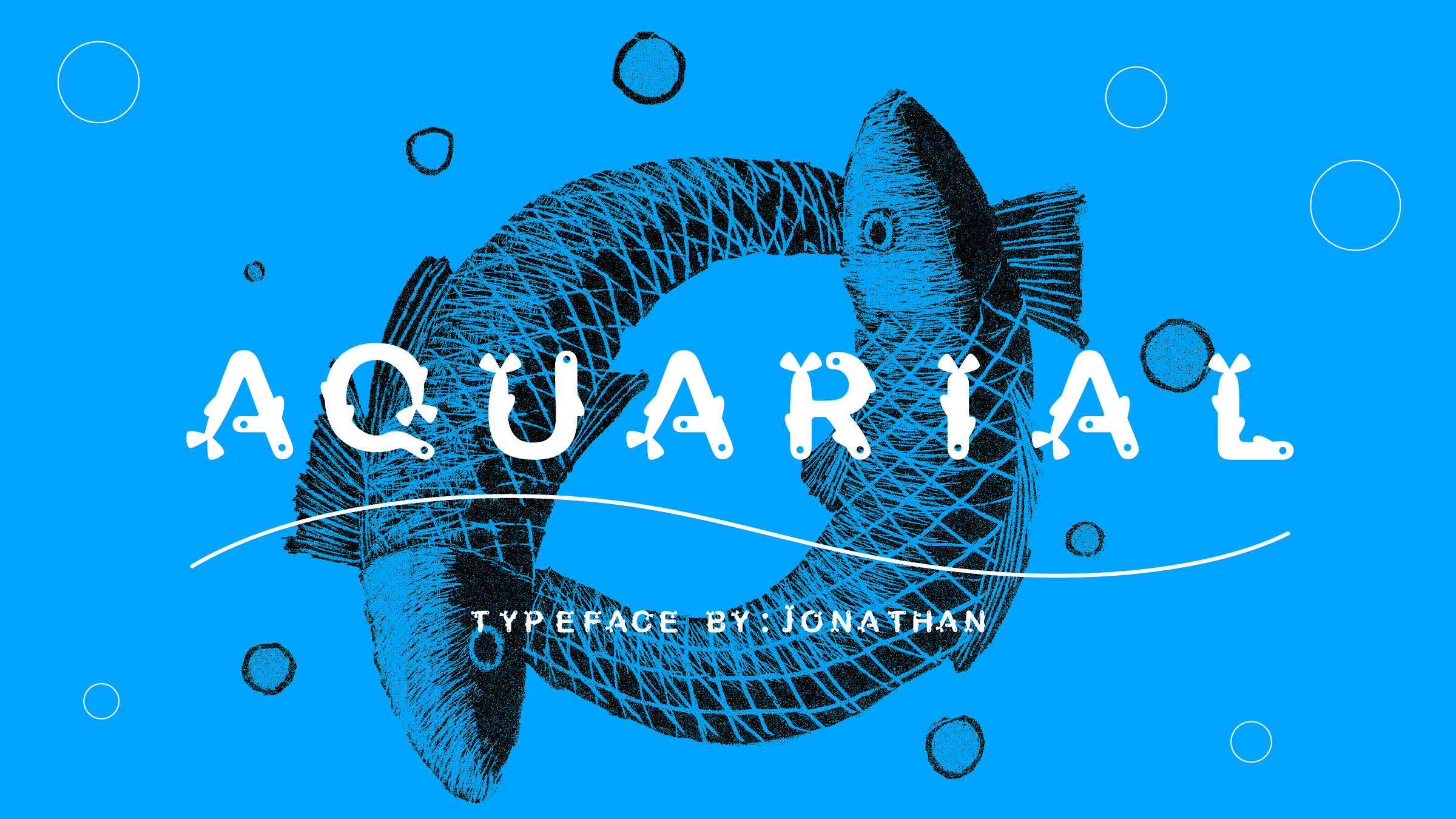
Aquarial typeface

Assignment:
This is one of my assignments for my advanced typography class, as students we were tasked with creating a typeface in order to build an appreciation and understanding of the work involved in letter design.

My process:
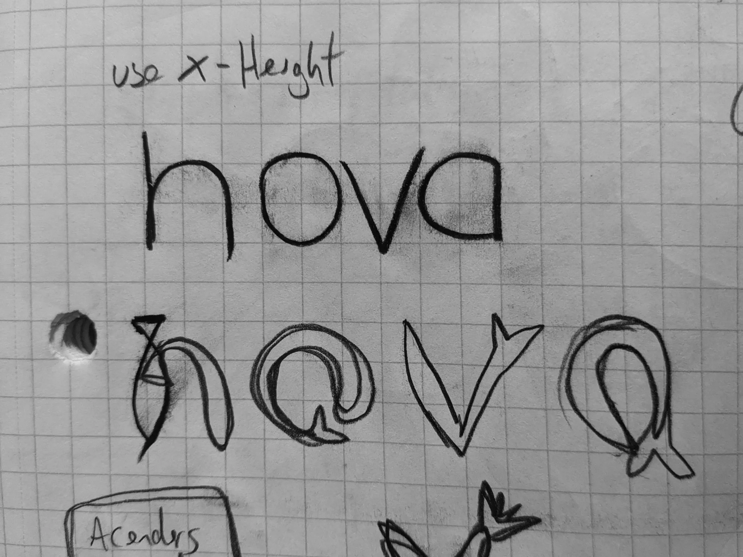
One of the first things we had to do was the creation the characters NOVA, the reason being that those characters alone could be tweaked to create the rest of the alphabet.
I experimented with creating a custom brush in order to work with organic lines and while fun to play with, I found the end result to be a bit sloppy.
I decided to modify an existing typeface in order to preserve I chose Arial because the letterforms were pleasantly legible, and carefully added eyes, dorsal, and tailfins to each character.
The fishtails are placed where the first stroke would be made for that specific character.


